The React data-table I always wanted
Feb 02, 2025 | by Maximilian Kaske | [engineering]
We have release our react data-table based on shadcn/ui a couple of months ago. While there's still in development, the PR #11 marks an important second milestone after the initial release a few months ago. We now have a solid foundation to focus on the component API design and data fetching. Though you can create your own data table using only config files (for "sheet," "filters," and "columns"), you end up writing more code than you would like.
If you want to try out the demo right away logs.run/i or go to the data-table-filters GitHub repository - it's open source.
Design improvements
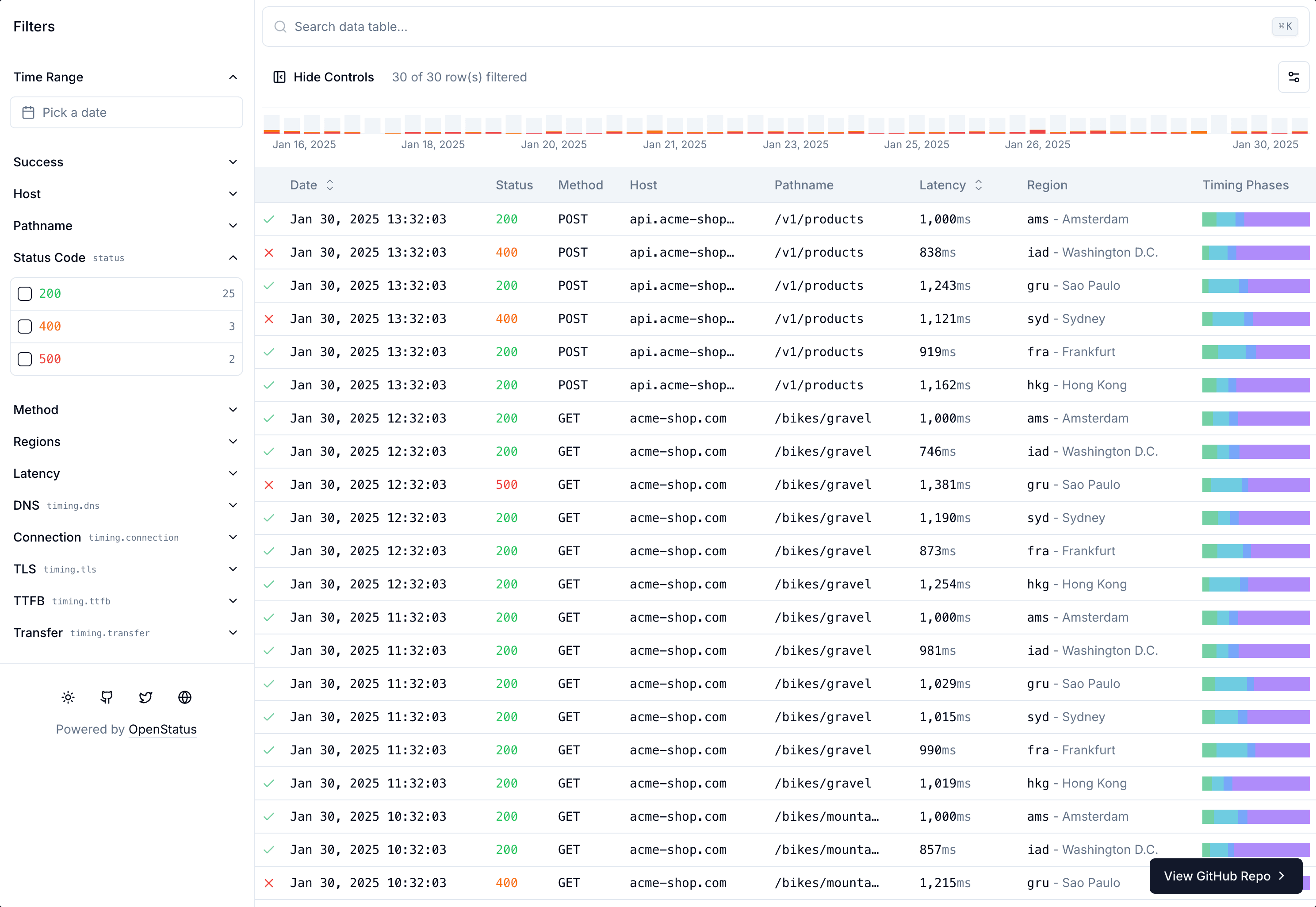
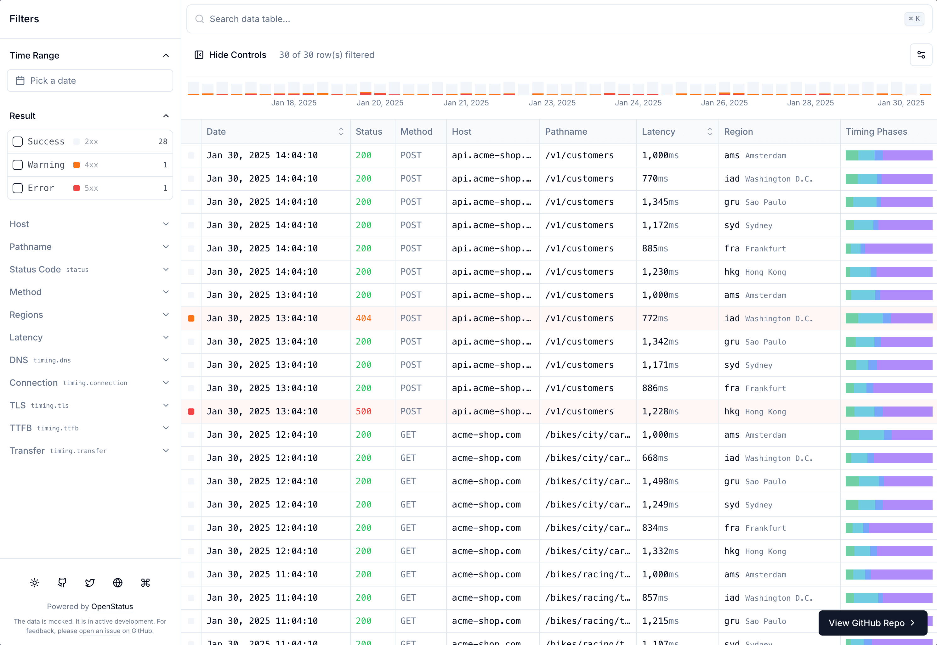
We've reworked the design. Adding table borders improves clarity and structure. We've replaced the Check icon with the rounded square already used in the Chart to maintain design consistency. We've also removed the "green" highlighting to emphasize bad requests instead.
A quick look of the before/after changes:
We have been inspired by Vercel, Datadog and Axiom when it comes to design and features.
Features
This time, we prioritized keyboard navigation to make table access and navigation quickly. We've added:
- "Skip to content" to jump straight to the table
- "Tab" navigation (with potential Arrow key support coming) + "Enter" keypress on rows
- Include filters in the details
<Sheet /> - Additional hotkeys to quickly:
⌘ Escreset focus (to the body, starting with "Skip to content")⌘ .reset filters⌘ Uundo column states like order or visibility
The W3 WAI (Web Accessibility Initiative) has two concise patterns for grids: The Grid Pattern and the Treegrid Pattern. The Grid Pattern focuses on cell navigation via arrows and the Treegrid Pattern focuses on hierarchical data with sub-rows, also using arrows to navigate. We might want to take an even closer look to the Web Standards to respect them.
The log data table leverages a lot of tanstack table core features and adds some additional customization to it.
Here's what's included in our logs data table:
- column resizing
- column reordering
- column visibility
- column sorting
- custom filter functions
- array facets support
- custom row/cell/header styles via
metadata - …and much much more
Creating data tables via configs might seem like over-engineering, especially given how unique and edge-case-heavy they can be. However, this approach can simplify many common use cases and serve as a valuable reference for building data tables with tanstack table.
Issues and hacks
We've encountered numerous issues along the way (unfortunately, I missed some of them). Here are the notable ones:
The biggest challenge was browser compatibility for table and thead HTML tags: making the thead sticky while horizontally scrollable with borders was surprisingly tricky. While it worked in Chrome, Safari wouldn't show the header border, despite using the same approach that worked for table cells. After some CSS exploration, we found a solution. Read about the issue here.
Several smaller hacks were necessary:
To highlight the table rows, we added negative outlines to fit within the container. This prevents the table overflow from cutting off the outline. We couldn't use the border attribute since the table's left-hand border serves as a separator between filter controls and main content (including cmd k, chart, and toggles).
Used tailwindcss classes: focus-visible:outline-solid outline-1 -outline-offset-1 outline-primary focus-visible:bg-muted/50 data-[state=selected]:outline-solid
In general, whenever there are outline issues due to
overflow-hidden, I often tend to add negative margin with the same positive padding to the element-m-* p-*.
To reset the active focus element (returning to the first focusable element in the document), we found no web standard solution. While document.activeElement.blur() dismisses the current focus, it remembers the last focused position. Our solution: manually setting and removing a tabindex attribute on the body.
document.body.setAttribute("tabindex", "0");
document.body.focus();
document.body.removeAttribute("tabindex");
While not an issue in this update, we've repeatedly found that when using recharts, the date property can't be a Date() for x-axis label reading and formatting. You must use it as string (toString) or number (getTime) – not the most intuitive approach.
One persistent issue is the flickering of default values on the <Accordion defaultOpen={...} />;. This occurs on the official radix-ui during page refresh (not client-side navigation) in Safari/Firefox, but not Chrome. We have opened an issue #12 if you have solved that problem before and want to contribute.
Whenever I encounter an issue, I try to leave a
REMINDER:comment. That way, I can easily search within the files and have a good reminder to not remove the code untested. Also this helped me to write that blog section at the end without having to leave the code.
Performance
Performance is improving. We've moved most of the state into a dedicated context, so only components consuming it rerender. Previously, our entire data-table-infinite.tsx component would trigger rerenders for all child components on any property change.
Very important: we will stick with the shadcn defaults and avoid additional libraries except nuqs, an excellent type-safe search params state manager supporting major React frameworks. We'll keep using React Context for state management, letting you choose your preferred library (zustand, jotai, redux) when needed.
We've added debounce to all possible controls to prevent renders on every keystroke. This helps with input searches and slider value changes.
A simple example of reducing the re-render is by using a dedicated ControlsContext that toggles the data-expaneded attribute. With css only, you can then hide or show containers based on the value. See the @taiwindcss v3/v4 example:
interface ControlsContextType {
  open: boolean;
  setOpen: React.Dispatch<React.SetStateAction<boolean>>;
}

export const ControlsContext = React.createContext<ControlsContextType | null>(null);

export function ControlsProvider({ children }: { children: React.ReactNode }) {
  const [open, setOpen] = React.useState(true);

  return (
    <ControlsContext.Provider value={{ open, setOpen }}>
      <div
        /**
         * How to use the controls state without rerendering the children
         * components that do not consume the context with tailwind:
         * "hidden group-data-[expanded=true]/controls:block" (v3/v4)
         * "hidden group-data-expanded/controls:block" (v4)
         */
        className="group/controls"
        data-expanded={open}
      >
        {children}
      </div>
    </ControlsContext.Provider>
  );
}

export function useControls() {
  const context = React.useContext(ControlsContext);

  if (!context) {
    throw new Error("useControls must be used within a ControlsProvider");
  }

  return context as ControlsContextType;
}
Don't sleep on css and basic html!
The new React Compiler reduces our need for memoization while delivering great out-of-the-box performance. We’ve enabled in our Nextjs project, and we plan to include it in our future Vite example. We still need to add virtualization for handling larger tables (rendering only visible portions of the list).
If you want to learn when your components rerender, I highly recommend the react-scan library.
We can avoid one full table rerender on row selection, which happens due to the rowSelection key used for outlining selected rows while the <Sheet /> is open. But hey, it's a nice visual touch to see which row is selected, so we're keeping it for now.
Feature Requests
The mobile navigation needs more love. Horizontal scrolling now gives access to previously hidden columns. Currently, we simply place filter controls at the screen's top. This should move into a Drawer component for better touch screen UX #13.
To make the data table more accessible for React users, we need to create a simple vitejs example #14 that doesn't rely on Nextjs (except maybe for the /api endpoint to fetch data from any server)!
A fun feature is support for natural language filters #15, allowing to write the filter and let AI translate into the correct filter:query using AI and the config models!
Feel free to open a GitHub issue with feature requests or encountered bugs, or contribute directly by opening a PR.
What's next?
The <Component /> API designs including the different config objects and /api endpoint standardization will drive our next bigger improvements. While I'm unsure when I'll have more time to focus on this, the current state makes for a perfect break point.
Thanks for the read and see you in a while! And don’t forget to leave a star if you enjoyed it!
Try the demo logs.run/i or checkout the data-table-filters repository.