We Are So Back
Aug 03, 2025 | by Maximilian Kaske | [company]

With a few days delay exactly two years ago (30.07.2023), we launched openstatus with Thibault. Today marks the day we sit together for the second time in real life and are launching the new version of the dashboard. What a blast!

It didn’t start from nowhere. Over the last few months, we’ve collected users feedback, worked on our product strategy and listened to our core heart: monitoring and status pages.
Before diving in, if you are new - create an account - or just login with your existing one!
New Dashboard - What has changed?
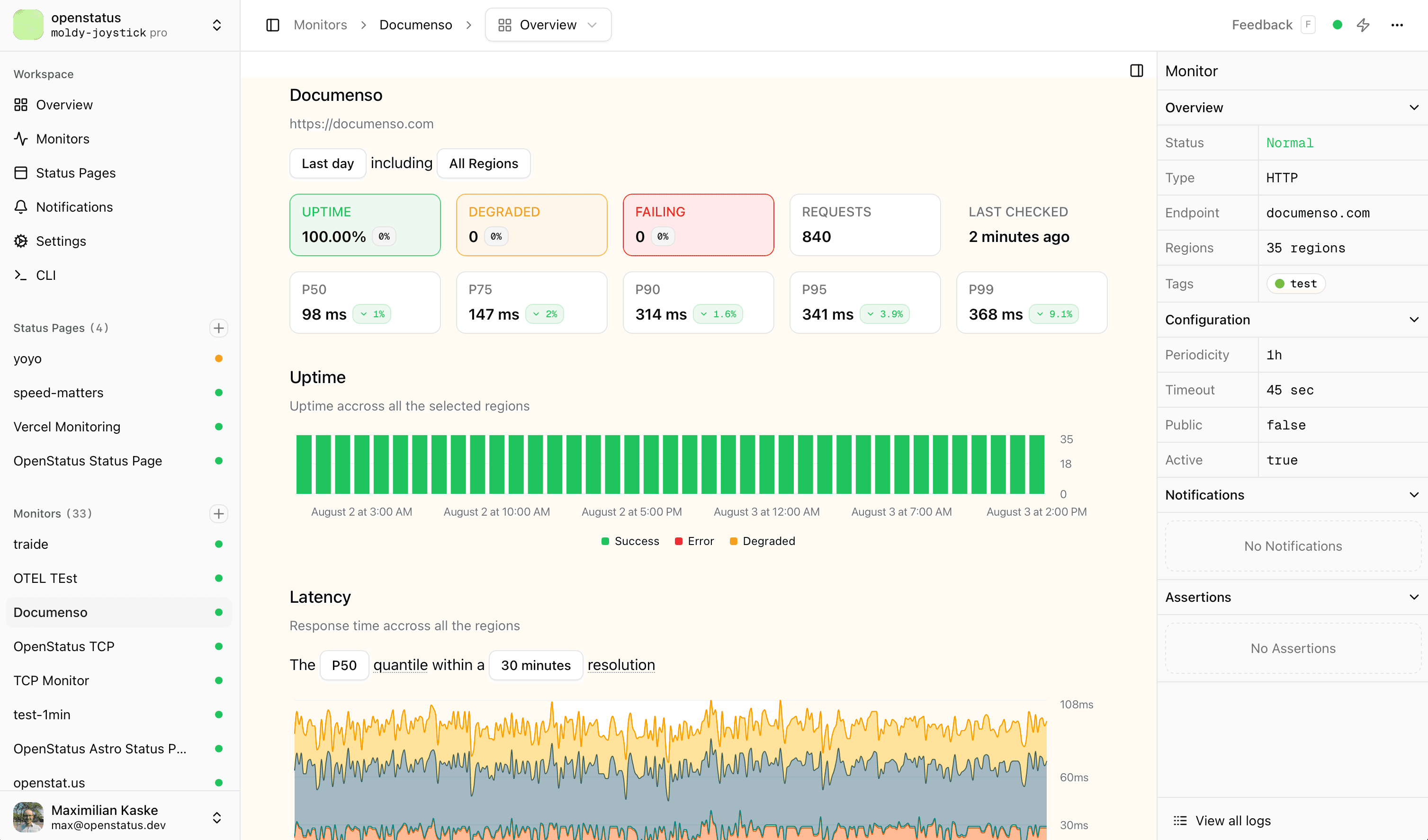
Let's compare right away: old (1) vs new (2) dashboard!
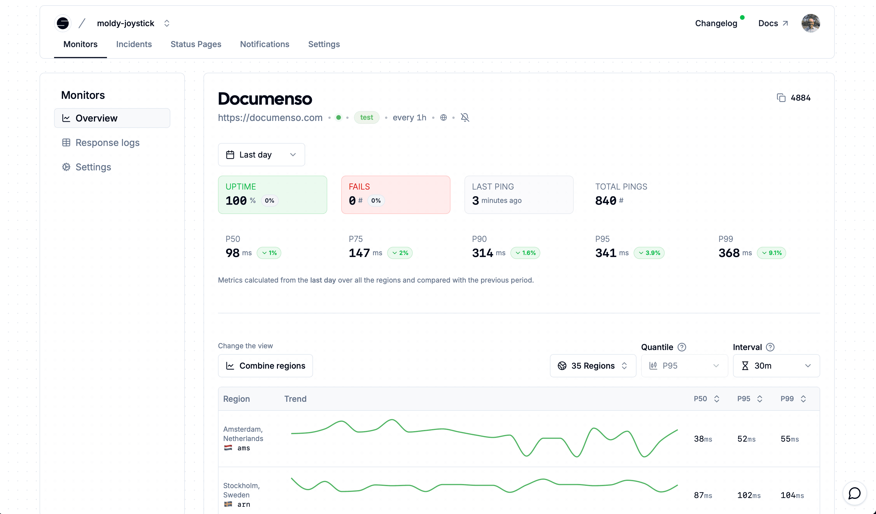
Different Layout
The new design will look different to what you know from openstatus and might look more familiar - maybe boring. From day one, we used shadcn as our design system - back when it had just started as well. It's been in our DNA. We're keeping everything you already know, but with different color templates and the removal of the dotted background. We hope you won't miss it too much.
Obviously, the biggest change on first sight is the layout: we are embracing the sidebar navigation to share more informations. Every individual status page or monitor will be shown there, making it easier to navigate across entries and create new ones on the fly. They also include the status of the current entry (e.g. active, error, degraded) - heavily inspired by Tinybird's dashboard sidebar.
Since we moved the main navigation to the sidebar, the top header now shows breadcrumb navigation and lets you quickly switch between subpages via a select option.
We’ve also added a right-hand sidebar with additional information about the page you’re viewing. It’s hidden by default to avoid overwhelming you, but can be revealed when you need it – inspired by Axiom.
The products you use, inspire the products you build.
We removed the top-level 'Incidents' navigation. It took too much visual space and had little impact on how users interacted - which is normal, since we hadn’t invested much in it. We don’t want to solve everything related to uptime monitoring. What we do want to solve, we want to solve well. That requires focus - otherwise you start over-bloating the dashboard.
Instead, each incident now lives within its corresponding monitor’s subpage. We are not competing with on-call or incident response tools. Instead, we’ll build integrations so you can pick your favorite tool. Contact us if you’re missing an integration.
More Elements
We have been collecting data that we never displayed. Sometimes you design something internally but realize users could benefit from it too. That was the case with our Tinybird audit_logs table (btw, proud of the implementation on GitHub). We track:
- From which region your monitor fails
- When it’s degraded
- When and to which channel we send notifications
Until now, this was invisible in the dashboard. We’re adding the Timeline Table so you can keep track of internal state changes.
But there’s more - three new visual components to help you understand your monitors at a glance:
- Timing Phase Area Chart: Shows the full breakdown of request timing phases (DNS, transfer, TTFB,...) across all selected regions, making it easy to spot where delays are happening.
- Uptime Bar Chart: Provides a more granular view of uptime, along with the number of pings we’ve sent to your endpoint and the request status (success, degraded or error)
- Degraded Overview Card: Highlights requests that didn’t fail outright but were still degraded, helping you catch subtle performance issues before they escalate.
We’ve also reworked the Response Logs Table. You can now filter by custom date ranges within the last 14 days.
New @shadcn template
We are dropping a new dashboard template free to use! The openstatus-template is a full shadcn x Nextjs SPA (so BYO router) starter kit with some dashboard components ready to use via shadcn CLI.
https://template.openstatus.dev
Everybody's dashboard requires some high-level components for sections, forms, action cards. That's what makes the component part of react so simple. We've been embracing the CSS pattern to name every component with a data-slot="name" so that the siblings, children or parent component change if the component exists. Same belongs to the data-variant="name" data states where you can switch between different styles. Once it clicks, you're not going back.
For example is our FormCardContent using the following tailwind class:
const formCardContent = "px-4 group-has-data-[slot=card-upgrade]:opacity-50 group-has-data-[slot=card-upgrade]:pointer-events-none"
// you should still add <input disable={LOCKED} /> within the form
That way, whenever we add the FormCardUpgrade component into the mix, it will automatically change the behavior of the content.
Tailwind + shadcn is faster to design as dev than starting with Figma.
We are providing them to you via shadcn cli, like:
pnpm dlx shadcn@latest add https://template.openstatus.dev/r/form-card.json
The following components are ready to be quick-installed:
form-card- inspired by Vercel’s settings cards with clear section separatorsmetric-card- inspired by Checkly's overview cardsaction-cardsectionempty-state
Refer to the README for more informations.
Use it, star it, share it!
New Dashboard - What was our approach?
Phase 1: Vision - finding our value
We had to first understand our value in this wide ecosystem and what we want to focus on. We can't do everything our users ask for - otherwise we will loose sight of our true goal: empower devs to easily monitor APIs and Websites and connect to their users if something unexpected happened. Should be simple right?
Read more about how we worked on our product strategy with Emily Omier.
Phase 2: Frontend - experimenting around
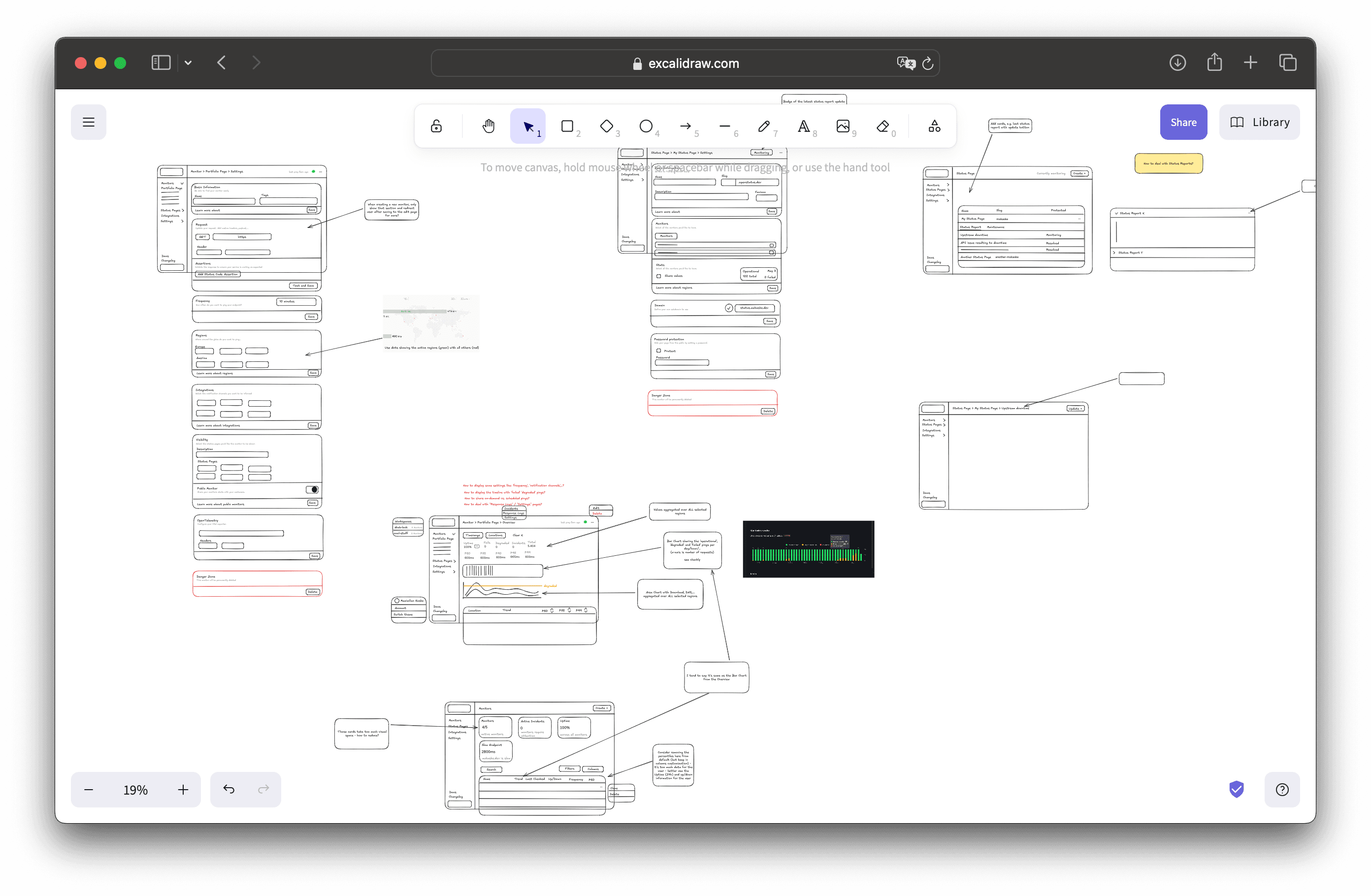
Everything starts with some sketches: Reassemble all picked components from different platforms.
How big can the canvas be? Yes
We started by only the frontend as full decoupled template, where we've added dummy data to not bother about the rest and fully embrace the UI/UX and iterate quicky on a lightweight nextjs project. It frees your mind from the overbloated (some call it design debt, which just naturally happens over time) vision and is much faster to run. The benefit for you? You have one more template to have fun with!
"If your product evolves fast, you should be paying this design debt every 2-3 years." - linear.app
We didn’t wait to update the marketing page – time is limited and waiting until “everything” is finished means it will never ship.
Phase 3: Backend - connecting the dots
We've taken a new approach, inspired by Midday to prefetch trpc queries on the server and hydrate them on the client. We've also optimized the number of procedure calls and DB calls to get data which makes it overall quicker to navigate.
As we had most of the dummy data structure similar to our DB schema, it was easy to update/create trpc calls.
Big thanks to all early testers that provided incredible feedback and helped us shape the new dashboard. Starting from the template itself to once the dashboard was ready to be used. We really appreciate you.
Ask! Don't be scared to ask - people in the OSS space and beyond are increadibly helpfull and will let you know how they see your product.
Better CLI
You can now import your current monitors from the GUI into a YML file and apply changes to settings - or trigger checks when needed. Devs don't wanna switch context and want to keep track of changes within a version control. Let's enable them!
Read more about the latest changes in our newly published blog post.
To push monitoring as code, we are not only referring to our CLI docs but also create a dedicated /cli page with the most important commands, templates and links.
We'd love to here from what your use cases are and how you handle infra/monitoring as code.
Same Pricing. More Monitors.
To better align with the new changes, we've updated our pricing plans. Read more.
That's a wrap! We are back on track and more focused than ever.
But first, we’ll enjoy some summer vibes and then come back stronger - with improvements to the status page.
Cheers